/image%2F0703241%2F20140120%2Fob_b8b3b5_blog-header-new2.jpg "nail art - reviews - swatches - nail tutorials")
OPI Holland Collection for Spring/Summer 2012 - Review and swatches of Part 1: Cremes
Hello lovelies!


I finally managed to swatch the OPI Holland collection and today I'll show you the first half - creme shades. There is just 5 cremes and 7 shimmers. I like shimmers more so I'll keep the better last ;)
Holland collection was inspired by the country’s range of stunning shades – as seen in vivid tulips, windmill-dotted hillsides and bustling canals – the collection’s twelve shades offer a mixture of sophisticated neutrals and highly-pigmented brights. Collection contains 12 shades and is available from 8th February 2012.
Some of the shades are very interesting but not hugely popular but there are some very nice and wearable ones too.
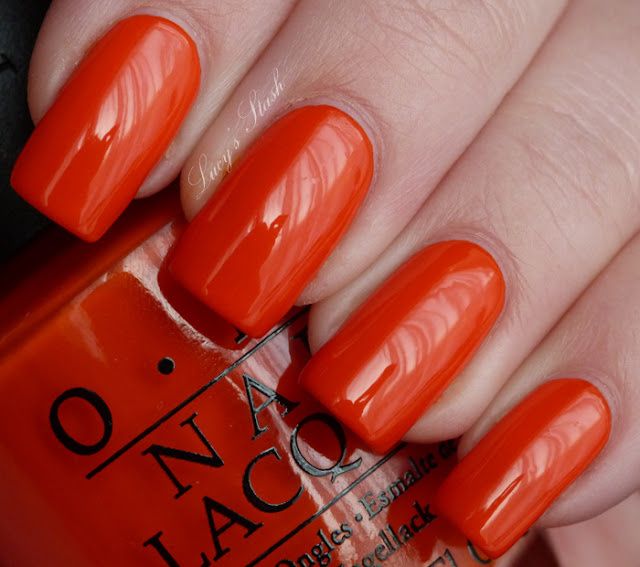
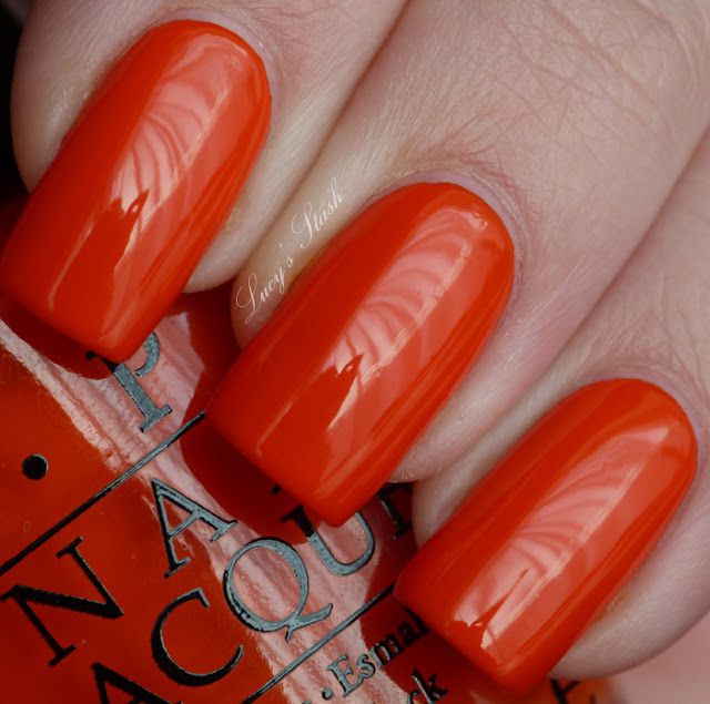
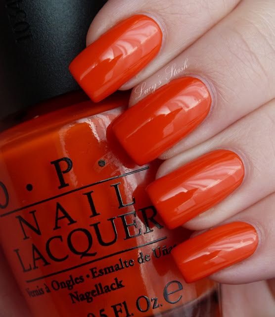
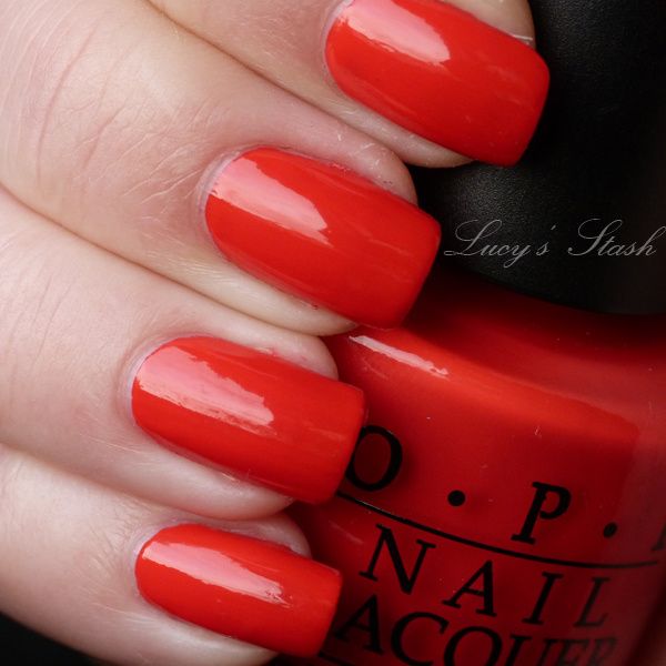
A Roll In The Hague - very bright and rich orange creme shade. This shade really reminded me Halloween orange but it is also great for summer as it's soo bright! The polish applied very nicely and has very good pigmentation. I've applied two coats and as you can see it was enough for a perfect coverage.
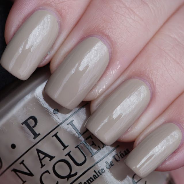
Did you ‘ear About Van Gogh? - described as sandy bisque creme. This is very unique and hard describable colour :) I don't have any similar colour to it in my stash and surprisingly it does look quite good on me. In the beginning I thought it's an ugly shade but once I applied it, it looked really cool and fashionable. I think the pictures are very colour-accurate so no need of describing it further. Formula is great again, this is two coats and it dried fast on me.
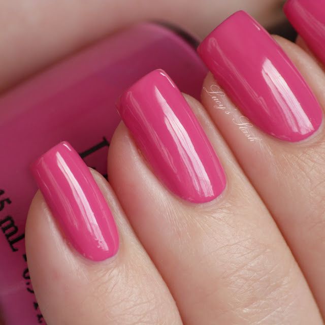
Kiss Me On My Tulips - hot pink creme. I've seen some swatches on other blogs that use artificial light where the colour was really bold and rich but you won't get that on the daylight...in artificial light, maybe. But still it's popular girly colour. The formula was very good as with all the creme shades - shiny, well pigmented and shiny. I'm wearing two coats.
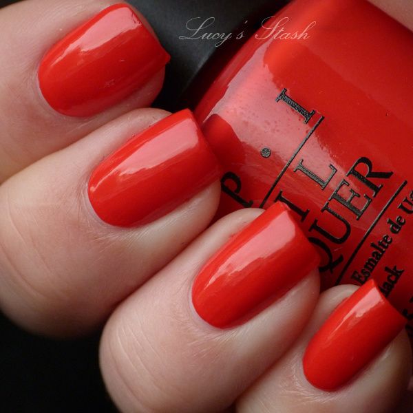
Red Lights Ahead...Where? - bright neon coral creme. The colour is something between red and orange neon colour, a bit coral I'd say. The formula is awesome! You could do with just one coat but I've applied two to cover few ridges in my nails. It dries fast and it applied like a dream! It was quite hard to photograph it as neon colours don't agree with most cameras :-/ I've done my best and I think the colour is I think 95% accurate, only little bit more bright neon.
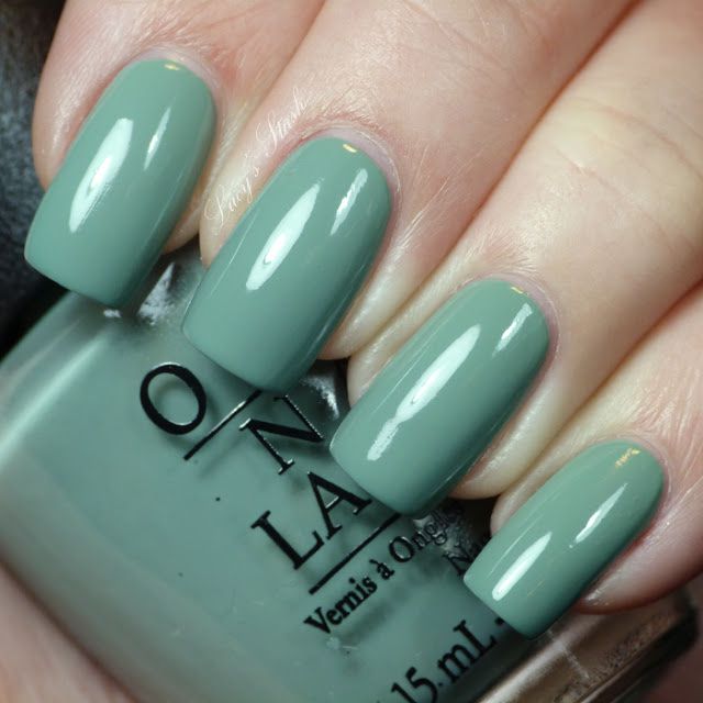
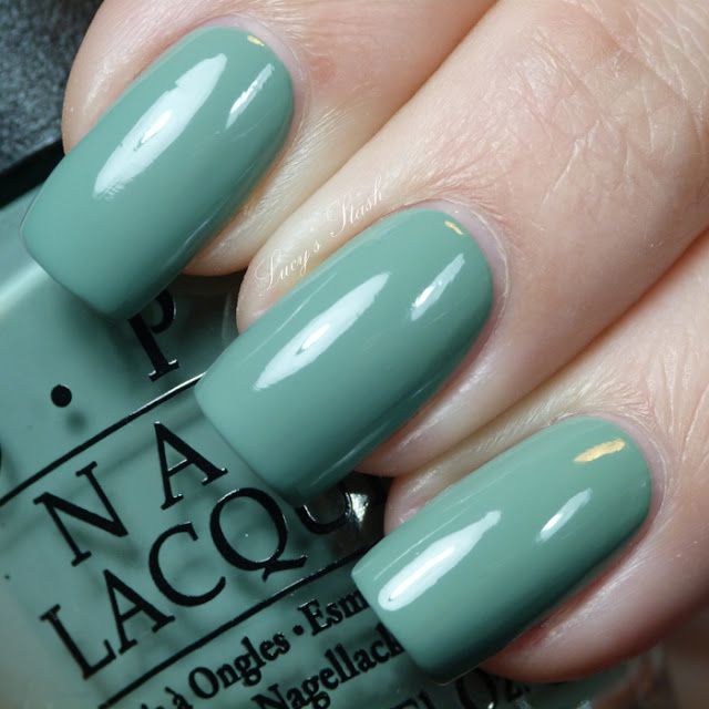
Thanks a Windmillion - pale cool-toned green creme. This is another a bit strange colour but it does look quite good, especially with Nubar Black Polka Dot layered over it ;) I wouldn't normally buy a pale green colour but since I had the rest of the collection.. :D Anyway - it is very well pigmented, I'm wearing two coats and it dried very fast. I think the last picture is the most colour-accurate.
So what do you think so far? I love them! All of the polishes have an amazing formula (pretty much OPI's standard) and some of the colours will be my summer go to's :)
In the next post I will review the rest of the polishes which are shimmers...those are always my favourite ;)
/image%2F0703241%2F20150613%2Fob_c0105e_retro-floral-stamping-decal-nail-art-3.jpg) Retro Floral Nail Art with SpaRitual Polishes
Retro Floral Nail Art with SpaRitual Polishes/image%2F0703241%2F20150613%2Fob_e9b3a2_sparitual-cultivate-1.jpg) SpaRitual Cultivate - Review & Swatches | Summer 2015...
SpaRitual Cultivate - Review & Swatches | Summer 2015.../image%2F0703241%2F20140910%2Fob_7e62b5_opi-coca-cola-collection-my-picks.jpg) OPI Coca-Cola Collection - My picks | Review & Swatches
OPI Coca-Cola Collection - My picks | Review & Swatches/image%2F0703241%2F20140821%2Fob_591241_stamping-and-gradient-nail-art-with-op.jpg) Stamped Gradient Nail Art with Video Tutorial
Stamped Gradient Nail Art with Video Tutorial